Jobber
Jobber provides a platform to help more than 100,000 home service professionals streamline and automate daily operations, from scheduling jobs to invoicing customers.
I was on one of the core systems teams that specialize in helping our customers to get paid faster. The team also intersects to a different focus where we build the foundation of embedded financial tools.
Selected projects
Jobber Payments
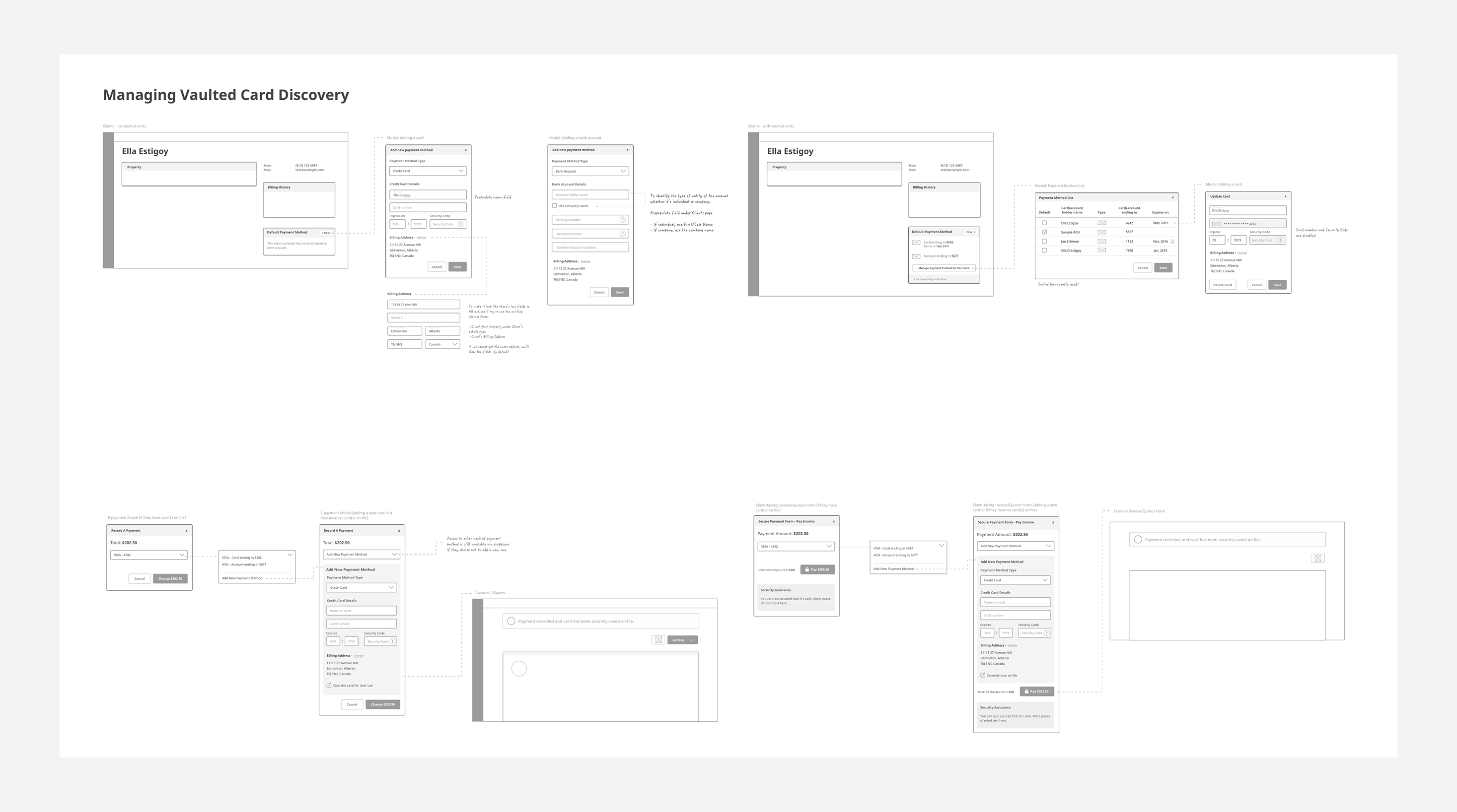
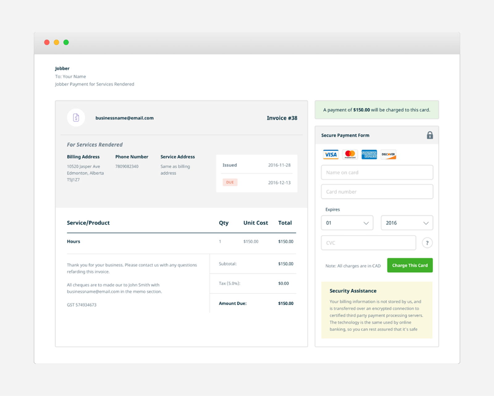
Jobber Payments is a fully integrated payment processing platform that allows service providers to securely save and charge credit cards in Jobber.
My role
Discovery, user flow, wireframes, visual designs, front-end development
The problem
Collecting payments from customers is a time consuming task for small business owners. Their clients who has to remember to write a check, then two days later has to find the service provider's email to confirm the total and who they should make it out to, and hopefully they have stamps handy if they have to mail it. Service providers then have to spend time by going to their bank to deposit cash and checks they received from their clients.
Our solution
A seamless payment processing integrated into the product experience, allowing service providers to easily collect payments from their clients through their invoices.
Jobber users are growing, so we focus on new sign ups that are looking for a system to manage their business.
Goals
- Have service providers easily opt-in to use Jobber Payments in replace of other epayment options
- Have a seamless experience from opting in, collecting payments, to viewing reports
My role and responsibilities
The scrum teams were newly formed and there were 2 designers for each team. With this big project, Darryl and I divide and conquer what each of us will tackle since we have to cover discovery of this new epayment, reports, and refund and dispute flow. At the same time, we consistently share our work with each other to get feedback and alignment before sharing with it our team.
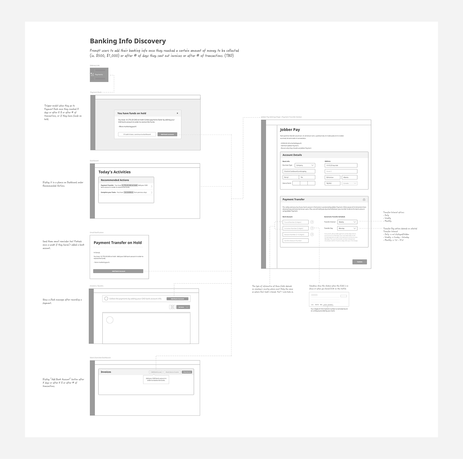
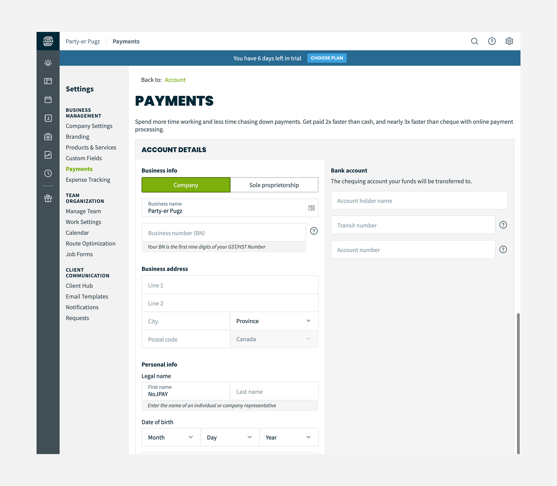
One of my design tasks was to focus on the user flow when they're on the settings section. I ended up designing its own settings page and a landing page to highlight the features and benefits and a CTA to initiate the opt-in and to make it consistent with other feature pages where a user can turn on a feature.
We then implemented our design with Rails and SCSS and make sure the layout adapts flawlessly for users who uses tablets and phones.
Constraints
We wanted to have a sign up that is seamless and doesn't prevent them from with their workflow.
During ideation, we went through several design concepts where we can show an opt-in modal when they're creating an invoice or setting up a deposit for quotes.
Going through Stripe's API at that time, there are limitations on how you should integrate the user information while signing up.
Initially we had user details and their bank information in step-by-step progress to minimize cognitive load, but ended up in combining them in one page in able to save the form.
Outcomes
Jobber Payments launched in December 2016 and has consistently contributed to increased customer loyalty. Existing users who were using third-party e-payment solutions migrated to our integrated system, appreciating the simplicity of managing everything in one place.
The wireframes became an essential artifact for the development team, and the user flows allowed stakeholders to visualize workflows for the first time, improving alignment across teams.
Retrospective
In hindsight, we could have conducted card sorting to determine whether the settings page was the optimal location for Jobber Payments setup. We also could have done user testing to confirm that the feature was easily discoverable for new users.
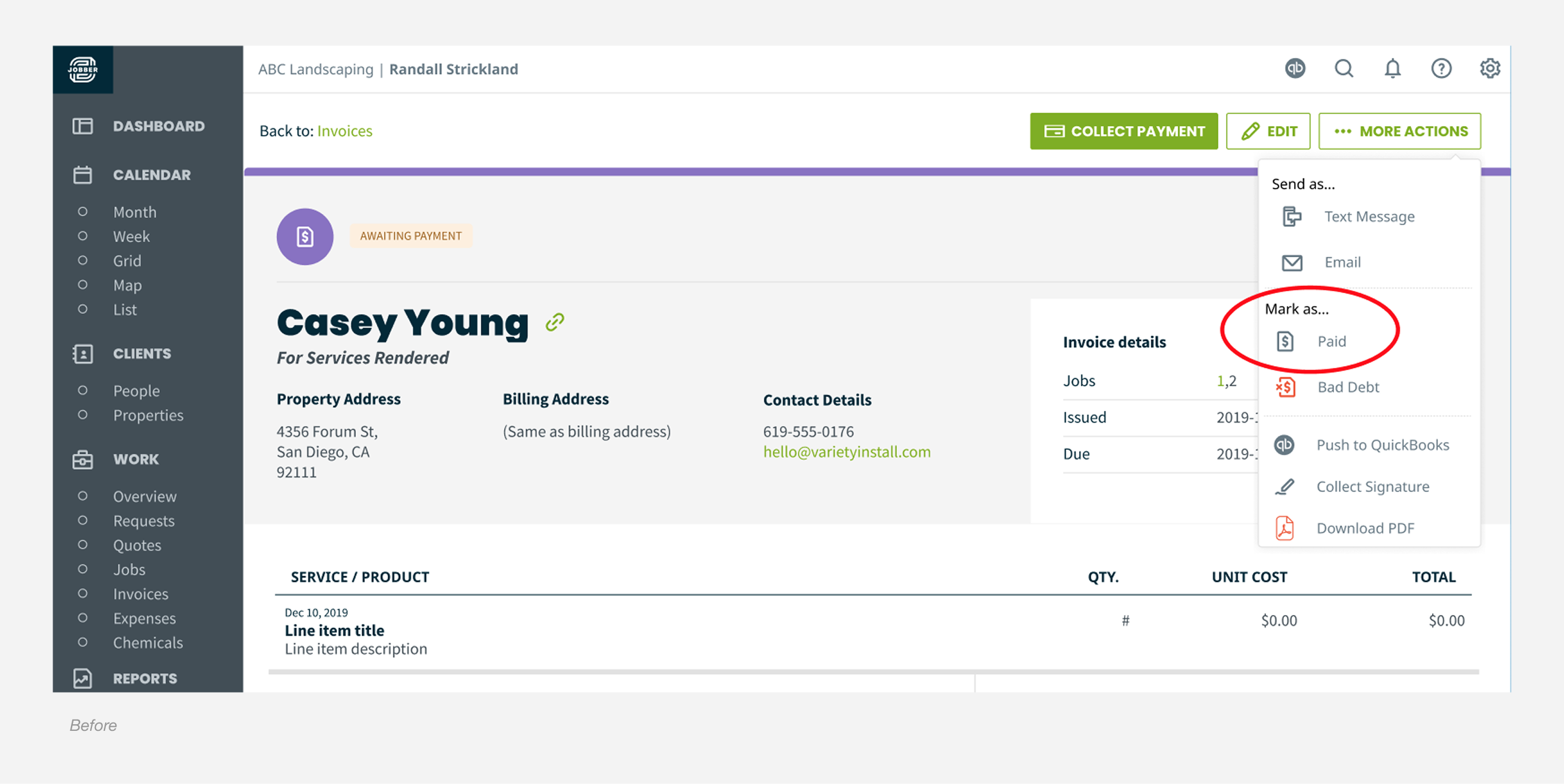
Mark as paid
One of Jobber's main selling points is the ease of invoicing. This improvement encourages service providers to collect or record payments to keep their client's account balances clean.
My role
User research, ideation, mockups, visual designs
The challenge
One of Jobber’s main selling points is easy invoicing, but users were misusing the “Mark as Paid” button. Unless they used the official “lump sum payments” or resolved QuickBooks sync issues, this action updated the invoice status without recording a payment. This caused incorrect client balances and frustrated admins.
Design process
To understand how users handled invoicing in Jobber, I reviewed customer feedback, spoke with our Success team, and ran a few informal user conversations. A pattern showed up quickly: many people relied on habit when marking invoices as paid, which explained the accidental clicks we were seeing.
With that context, I started sketching early concepts for improving the flow. After exploring a range of approaches, I narrowed them down to two or three stronger directions and built medium fidelity wireframes to share with the team. Sharing early helped validate assumptions, reveal gaps, and get alignment before moving further.
I also explored a few alternatives that we eventually ruled out, including:
- Keeping “Mark as Paid” and adding a warning
- Renaming the action without changing behaviour
- Removing the action entirely and waiting for Support feedback
These helped clarify what would actually solve the problem.
Solution
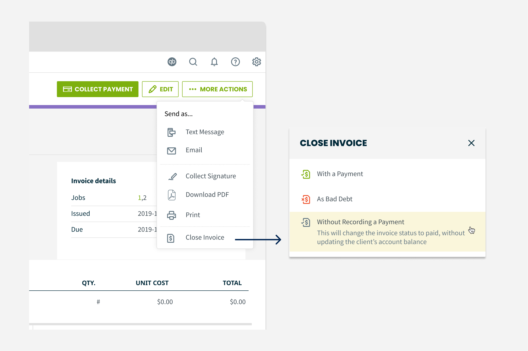
The reviews and explorations pointed us toward simplifying the actions menu. We removed both “mark as” options from the dropdown and moved them into a focused modal, making the flow more intentional and reducing accidental clicks.
We updated “Mark as Paid” to “Without Recording a Payment” and added a short description so users clearly understand what will happen if they choose it.
We also introduced a third option, “With a Payment”, which triggers the same modal shown when selecting the main “Collect Payment” button. This keeps the experience consistent and closes the loop for users who intend to record a payment.
Overall, the redesigned flow reduces habitual misclicks, clarifies the difference between actions, and creates a more predictable invoicing experience.
Constraints
We knew this solution is a bandaid and it’s not going to fix lump sum payments. It’s so very far out of scope and not in our foreseeable backlog in accordance with thematic goals and team priorities.
What about testing?
Due to the short timeframe of this project (we had a two-week sprint), we weren't able to conduct formal user testing. However, this didn't stop us from shipping a solution that was high-confidence through rounds of UX reviews and feedback gathering.
Outcomes
We worked on this in February 2020. Within 3 months of launching our solution, we started to see signals of positive impact.
- There was a decrease of closing an invoice without a payment. Although, the data still shows that there are still some users that closes an invoice without attaching a payment
- Confirmation modal can be a reusable pattern to be added in Jobber's design system
A little shout out from Jobber's CTO about the tiny workflow improvement:

Thanks for reading!