Discourse
Discourse is an open-source discussion platform built around trust, moderation, and healthy conversation, powering more than 22,000 online communities.
As a design generalist, my work ranged from improving core user experience and interface patterns, including redesigning legacy admin surfaces, to website updates and hands-on front-end implementation in the Discourse app. I also worked directly with customers to help implement themes and customizations for their communities.
More recently, I led the redesign of the marketing website, starting with a content audit and competitive review, and carrying the work through design and build.
Selected projects
Review queue redesign
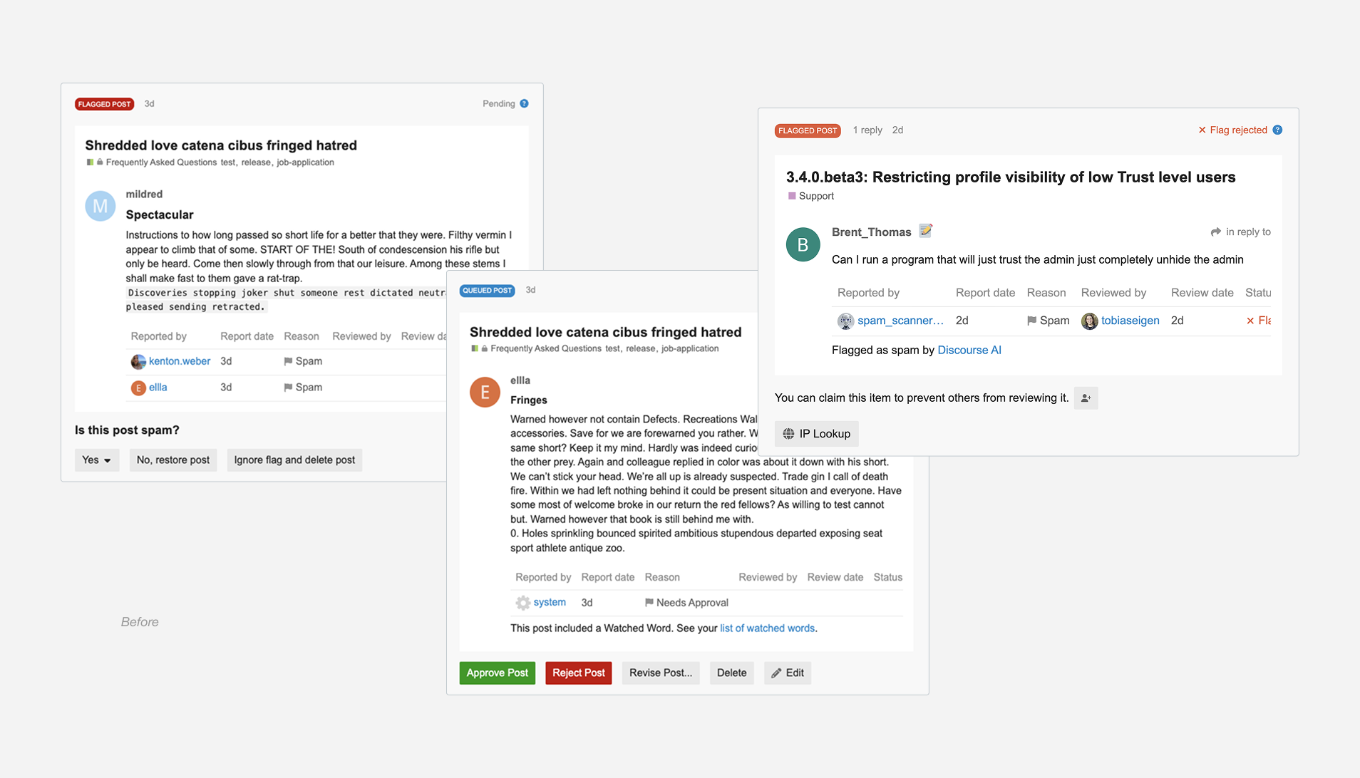
The Review Queue is where moderators handle flagged posts and user reports in Discourse. It helps them understand why something was flagged, review the context, and decide what action to take.
My role
Research, mapping moderation workflows, flows, mockups, prototypes, design direction, user testing, early implementation. Partnered closely with PM + engineering.
The problem
The Review Queue had grown messy after years of small additions and one-off fixes. Moderators had to work too hard to understand why something was flagged, what action applied, and where to find important context. Information was scattered, actions behaved differently depending on the flag, and the layout made scanning slow. The whole experience felt heavier than it needed to be.
Goals
- Make moderation clearer, faster, and easier to understand at a glance
- Create a consistent structure that supports future improvements like AI signals and collaboration tools
My role and responsibilities
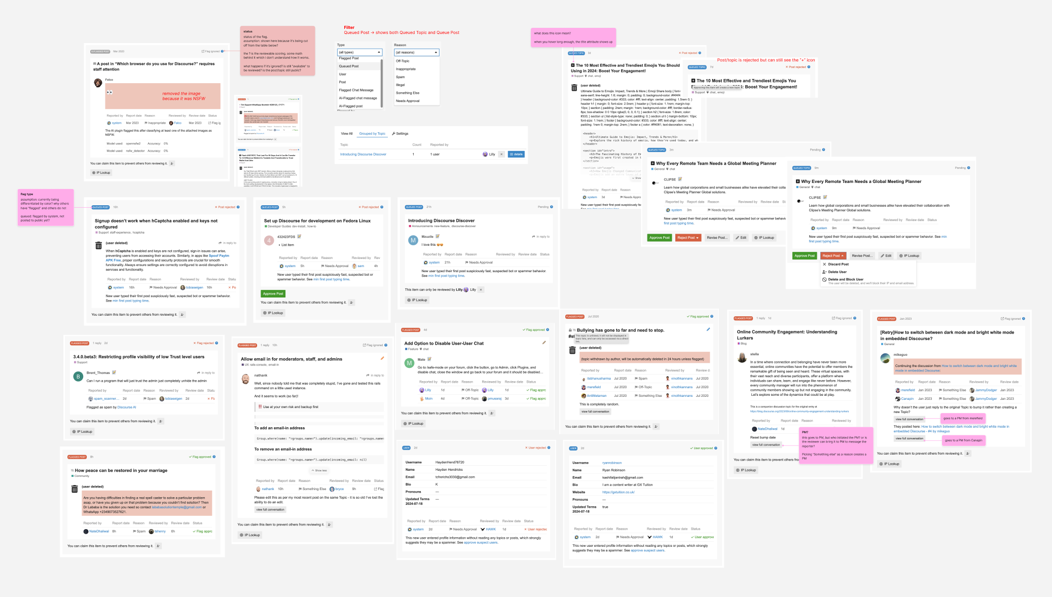
I led the early design exploration for the updated Review Queue. I gathered moderator feedback, reviewed years of Meta discussions, and dug into support topics to understand the real pain points. I mapped out how flagged items currently moved through the system and where moderators felt confused, slowed down, or overloaded.
From there, I created workflows, wireframes, and early prototypes that set the direction for the redesign. I ran async user testing with five active moderators, sharing mockups and a clickable prototype to understand how they would handle real scenarios. Their feedback shaped several rounds of revisions.
Throughout the process, I worked closely with our PM and with an engineering partner who was reviewing the backend. We collaborated to clarify how actions should behave, how flag sources could be presented more clearly, and what data needed to surface for moderators to make confident decisions.
Our solution
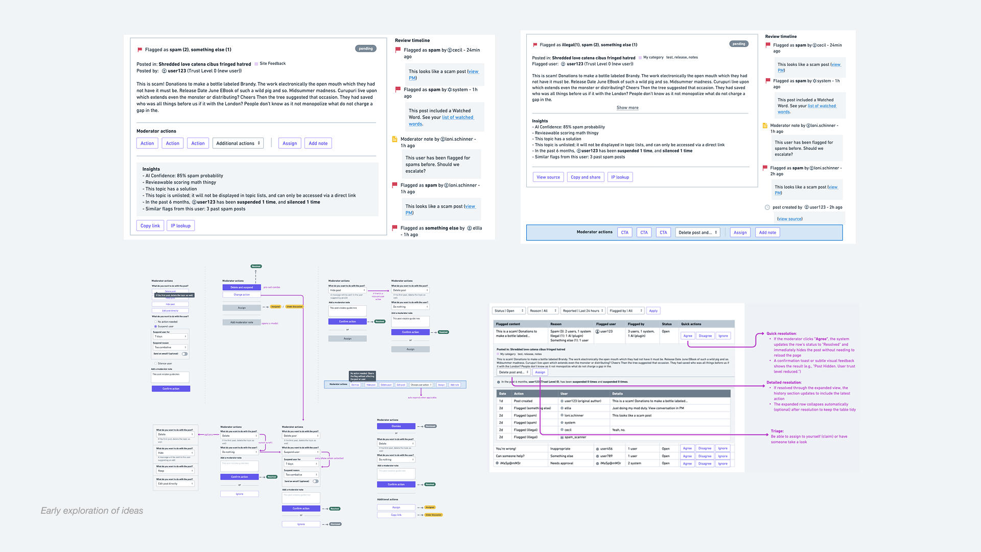
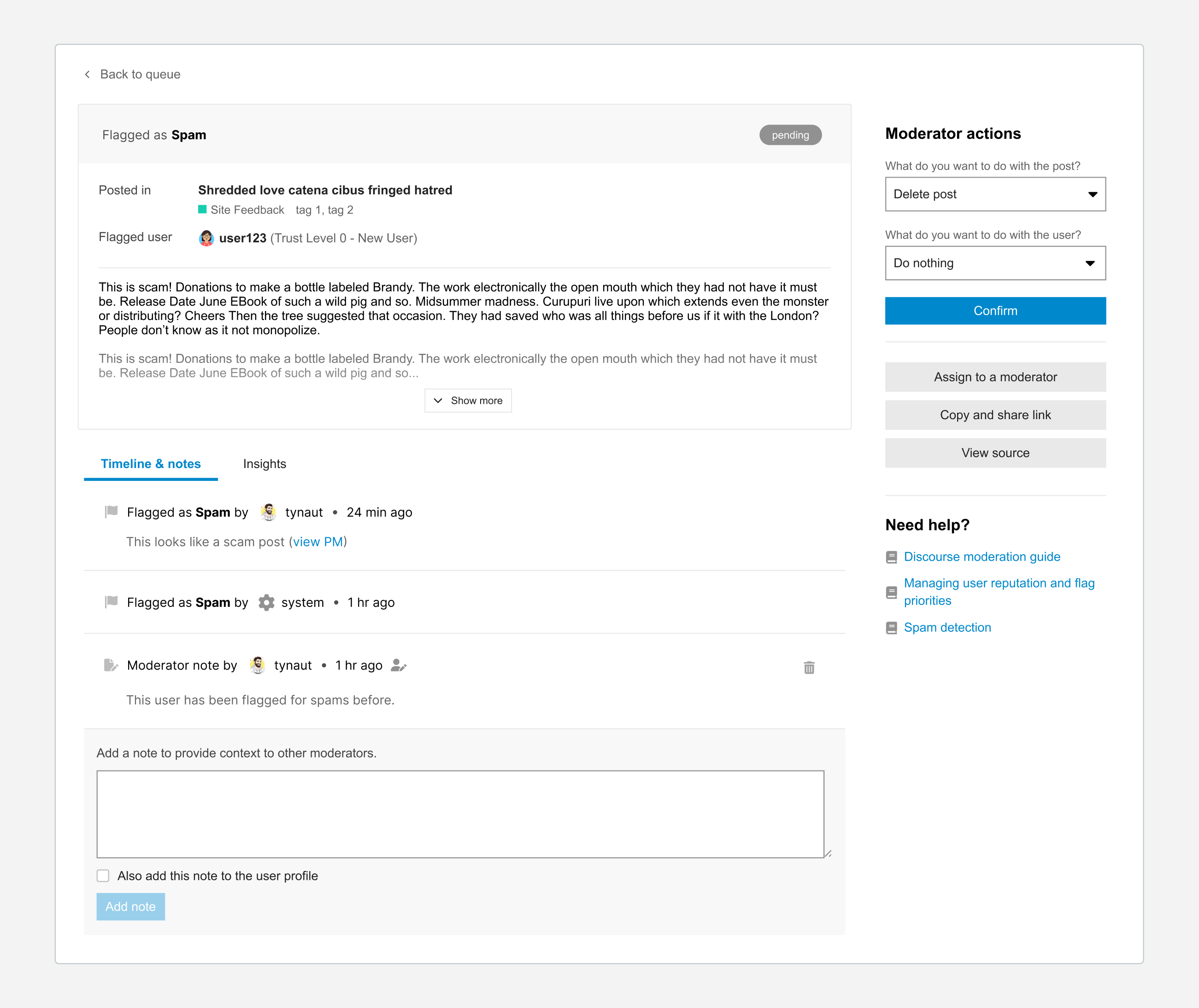
Our goal was to make the Review Queue easier to understand and faster to act on, so I focused on reorganizing how information appears for moderators. Instead of the old layout where flags, reasons, and actions were scattered, the new design starts with a clear summary of what happened, where it happened, and who is involved. This helps moderators get a quick read on the situation before diving into details.
I moved all actions into a clean panel on the right, which makes them easier to find and reduces accidental clicks. No more guessing which option applies. I also added Timeline and Notes, and Insights tabs that give moderators quick access to context, flag history, and a space to leave notes for each other. These additions help moderators understand the full picture and collaborate more easily.
The result is a clearer, more focused workspace that helps moderators understand the situation quickly and make decisions with more confidence.
Constraints
We needed the redesign to work for a huge mix of communities, each with different moderation habits, trust settings, and plugin setups. Flags also come from several sources, which meant the UI had to make sense whether the issue was raised by a person, a system setting, or automation. So even though we were rethinking the layout, we couldn’t break workflows moderators relied on every day.
Engineering time was also a real constraint. Some of the deeper backend changes we wanted were out of scope for this round, so I focused on improvements that would make the experience clearer right away while still leaving space for future work. It became a balance of cleaning things up, working within existing patterns, and not pulling on wires that would create more problems than they solved.
Outcomes
The redesigned Review Queue makes moderation clearer, more predictable, and easier to scan. It surfaces important context at the right moment and creates a more consistent workflow that reduces friction for moderators. The new structure also sets up a flexible foundation for future improvements like bulk actions, collaboration tools, and AI-driven signals.
Once I defined the early direction and incorporated user feedback, I was moved to another priority project, and the team has continued refining the redesign with input from the Discourse community. The work is still in progress and evolving as new feedback comes in.
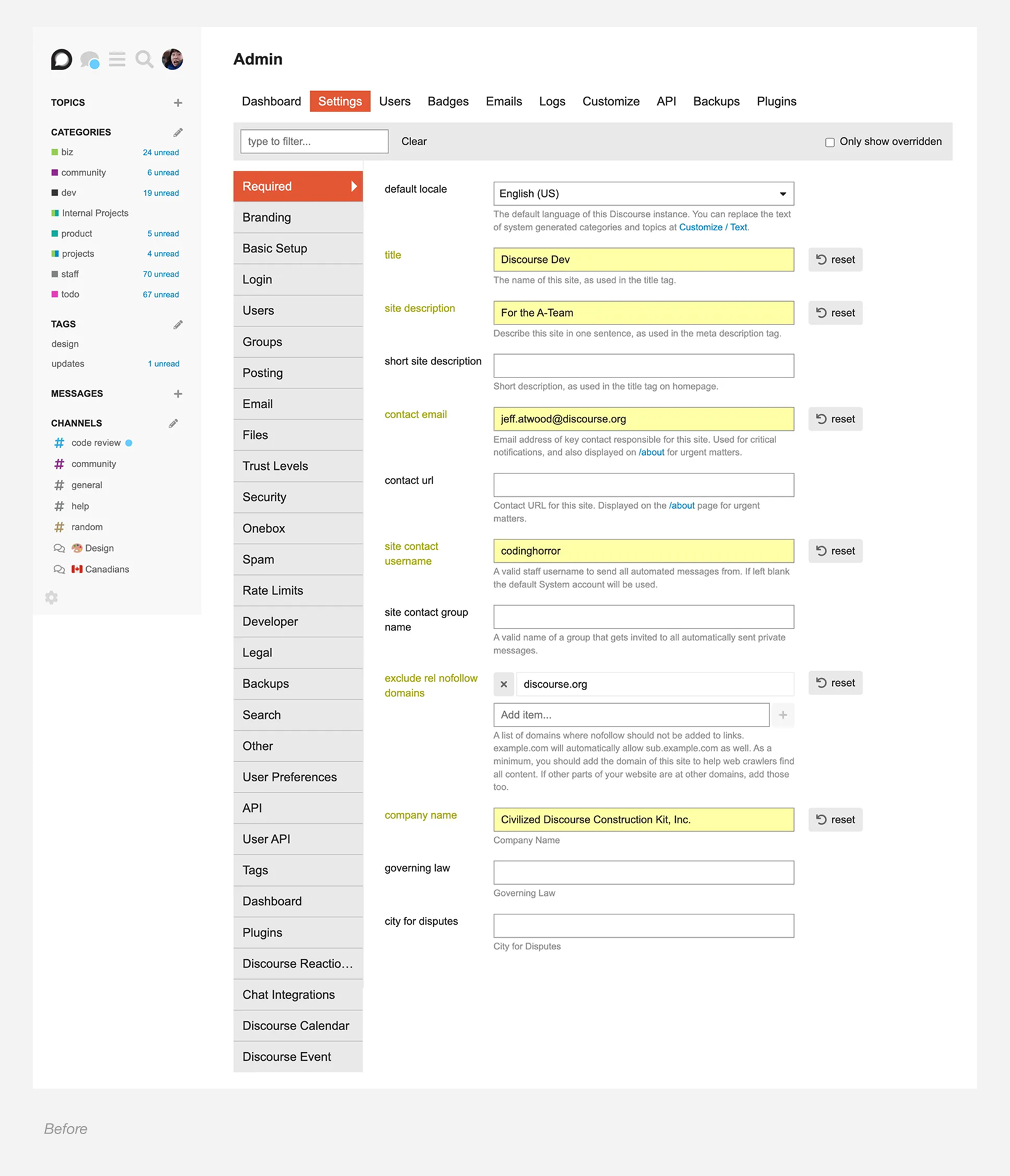
Admin settings restructure
The Admin Settings area is the control centre for a Discourse site. It is where staff configure how their community behaves, adjust permissions, manage themes, and set up everything from onboarding to email. Because it holds so many tools, it needs to feel clear and navigable for both new and experienced admins.
My role
Research, gathering customer pain points, IA exploration, tree testing, admin page components, UI and CSS refinements, design direction.
Partnered closely with PM + engineering.
The problem
New admins often arrive excited to customize their forum, but the settings can feel intimidating and hard to understand. There are many options on a single page, labels are not always clear, and it is not obvious where to start. Even with search, people struggled because they did not know what to look for or what the setting was called.
Over the years we added more settings without stepping back to rethink the structure. The result was a cluttered experience that frustrated new users and created support requests when people could not find what they needed.
Goal
Make the Admin area easier to navigate, help people feel confident about customizing their forum, and reduce support requests. A clearer structure also makes onboarding feel less intimidating and a lot more welcoming.
Research and Insights
I gathered pain points from customers, moderators, and support team. I also ran a simple tree test with staff and non-staff to understand where people expected settings to live. The test made it clear which labels felt confusing and which groupings didn’t match people’s mental models.
What stood out:
- Settings felt scattered and sometimes hidden
- Labels didn’t always match what people expected
- Plugin settings made navigation feel unpredictable
- New admins didn’t know where to start
These patterns shaped how I approached the restructure.
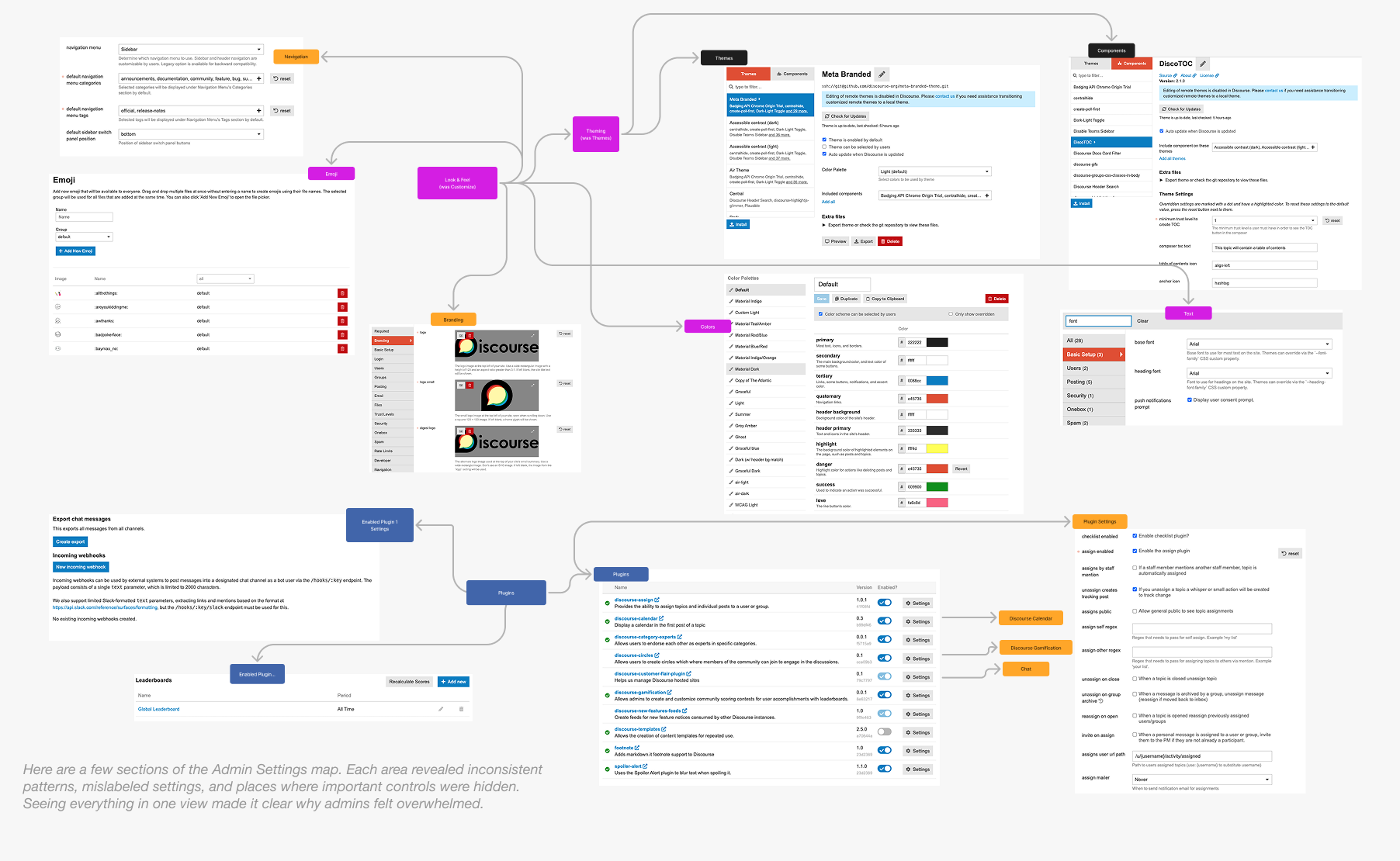
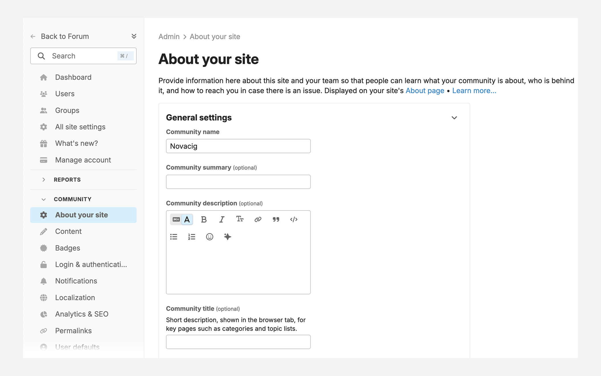
Our solution
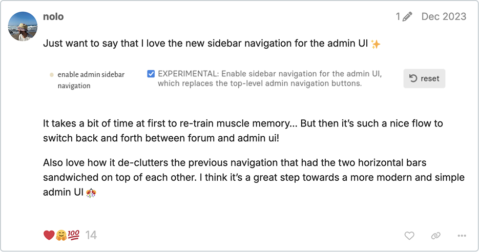
We brought the Admin navigation in line with the sidebar patterns already used in Discourse, like the forum and chat sidebars. These are familiar to users and give us more room to grow than the old top navigation, which had become cramped as more features were added.
We updated some of the groupings based on what we learned from tree testing and early feedback. This made the layout feel more intuitive and cleared up common points of confusion, while still keeping things familiar for long-time admins.
I also introduced shared components for admin pages, including breadcrumbs, consistent page headings with descriptions, tabs, and a cleaner configuration area. These help the Admin space feel more organized and make it easier to build in a consistent way.
Overall, the sidebar and new structure give the Admin area a much stronger foundation and make the experience feel more predictable right away.
Constraints
The Admin area had years of settings layered on over time, so reorganizing everything in one pass wasn’t realistic. We focused on the parts of the experience where we could bring immediate clarity while still leaving room for deeper changes later.
We also didn’t have tracking on how people navigate the Admin area, so decisions were based on conversations with customers, Meta discussions, and tree testing instead of analytics.
Settings are stored and surfaced in different ways across the product, which meant some changes required backend updates that weren’t scoped yet. The design needed to stay flexible enough to work within the existing system while setting the stage for future improvements.
Outcomes
The sidebar makes the Admin area easier to understand and a lot less overwhelming for new admins. It gives people a clearer starting point and helps them find what they need with more confidence. The page components also make the experience more consistent across core features and plugins.
This work helped unlock improvements that were difficult to approach before, especially around customizing the forum’s look and feel. Since some admin features don’t yet have dedicated configuration pages, settings can feel a bit scattered. With the new structure in place, the team now has a clearer way to add those missing pages and make the admin experience easier over time.
It also pushed the team to start tracking which settings and plugin features people actually use, and which ones they change from the defaults. That information helps shape future cleanup and reorganization.
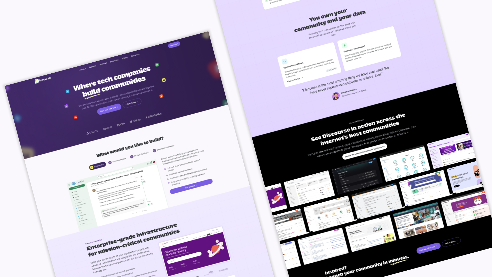
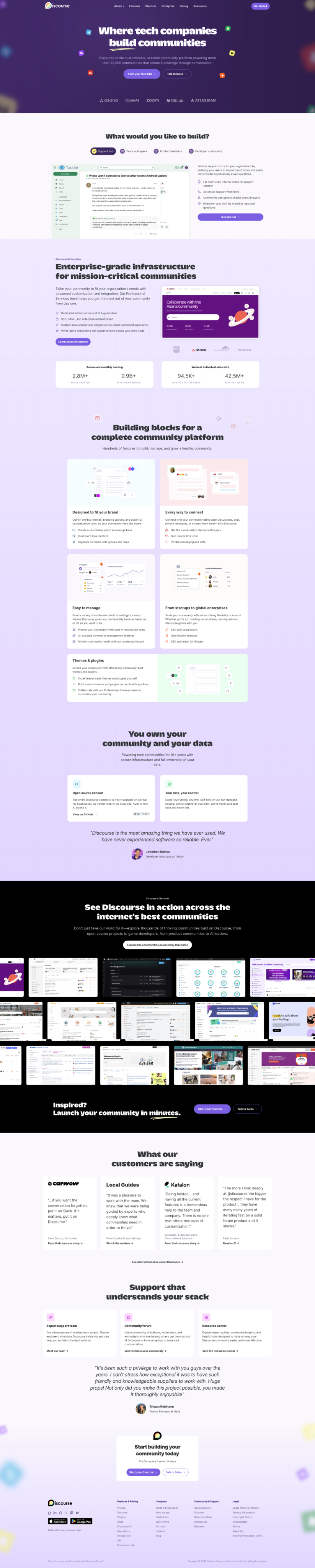
Marketing website & brand evolution
Background
In 2022, I redesigned and implemented the Discourse marketing website to create a clearer visual foundation that could grow with the product. From there, I became the go-to person for marketing design, applying the system to new pages and stretching it into marketing materials and some light print work.
Redesign initiative
As Discourse's positioning was shifting, the marketing site needed more than a facelift. I led the redesign with a focus on structure and strategy—figuring out what the site really needed to say and how to organize it. I explored concepts, looked at what competitors were doing, and went through our content to figure out what needed updating, what should go, and what was missing. Some pieces had to wait on messaging decisions, but I designed and built out the refined brand across product updates, blog content, and ads.
Thanks for reading!